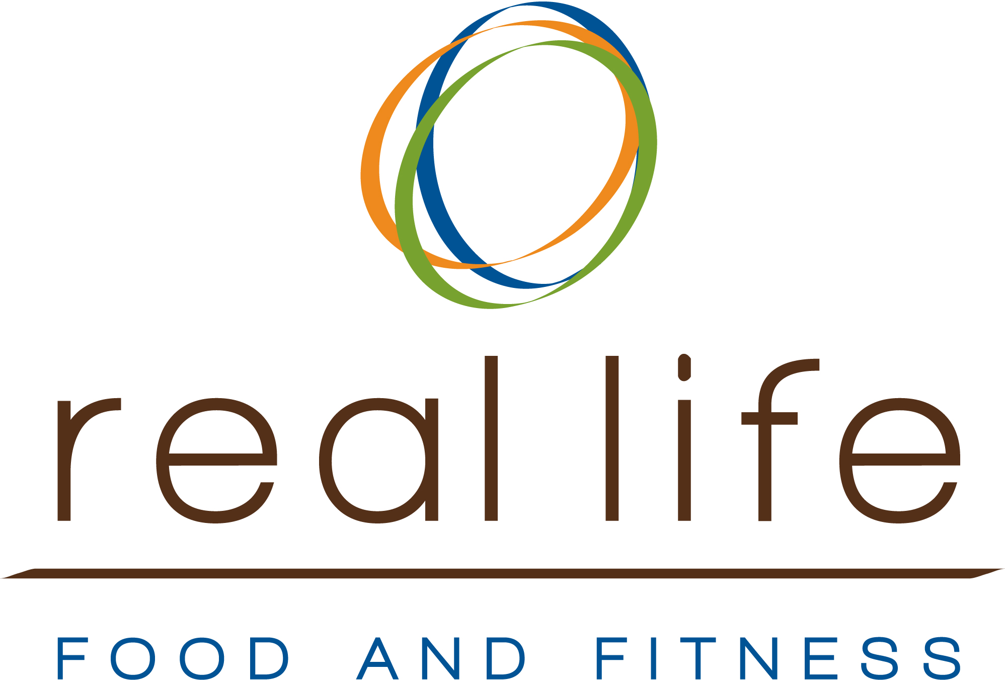
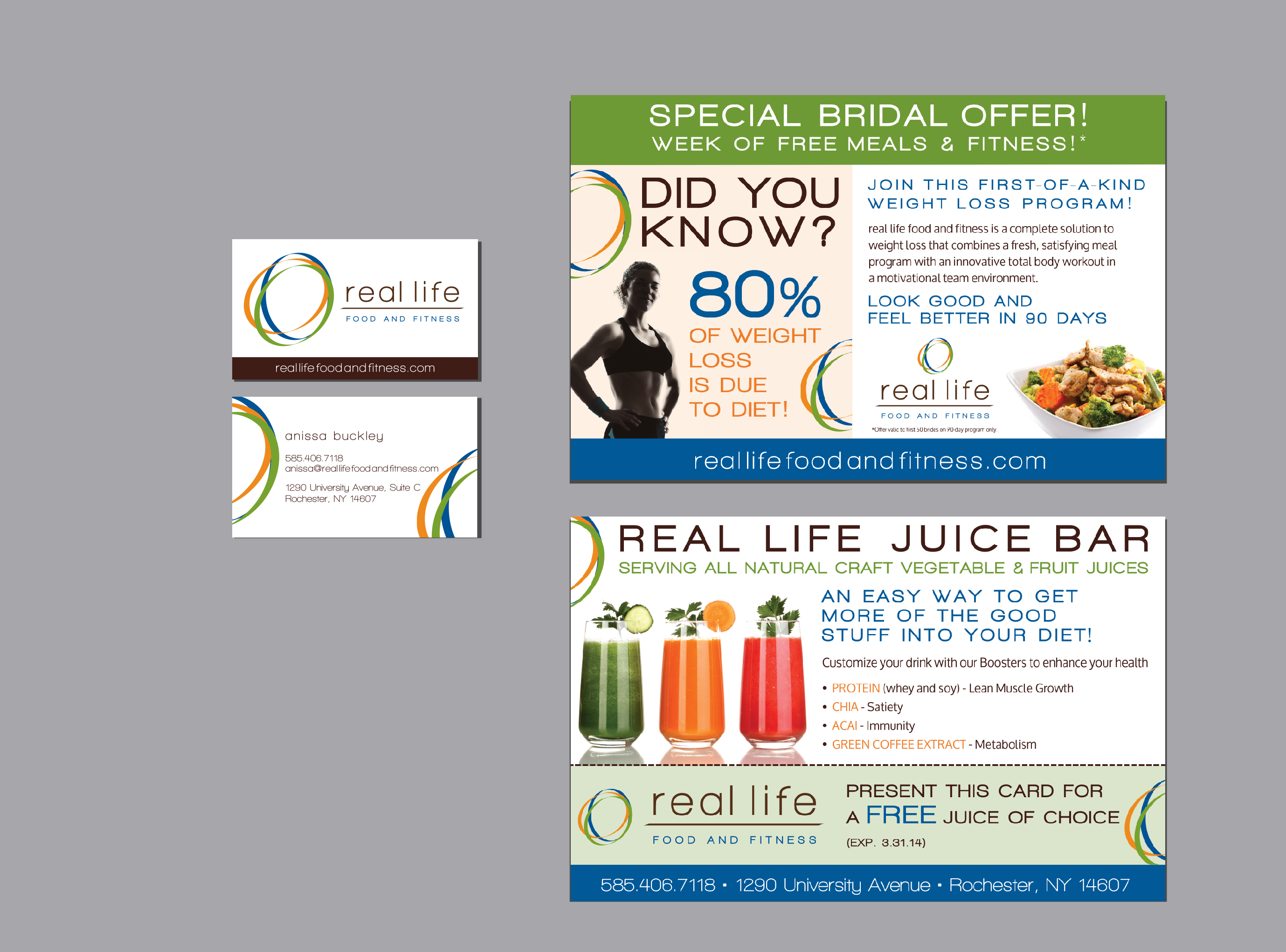
A new weight loss and fitness concept in Rochester NY was referred by another client. They wanted something to reflect the uniqueness of their location and decor and most importantly their very unique health and fitness concept. Something rustic but clean and simple. A tough combination but we developed a logo that comprised of 3 oval shapes to depict the 3 crucial elements of their branding concept — food fitness and frame of mind– the green for food – fresh, the orange for fitness – energy and the blue for frame of mind – healing, calm. In the end the logo was fresh, inviting, eye-catching and a building block for their business.
- Client:
- Categories:
- Skills:
- Project Url:
- Share Project :
 Previous Project
 Next Project


